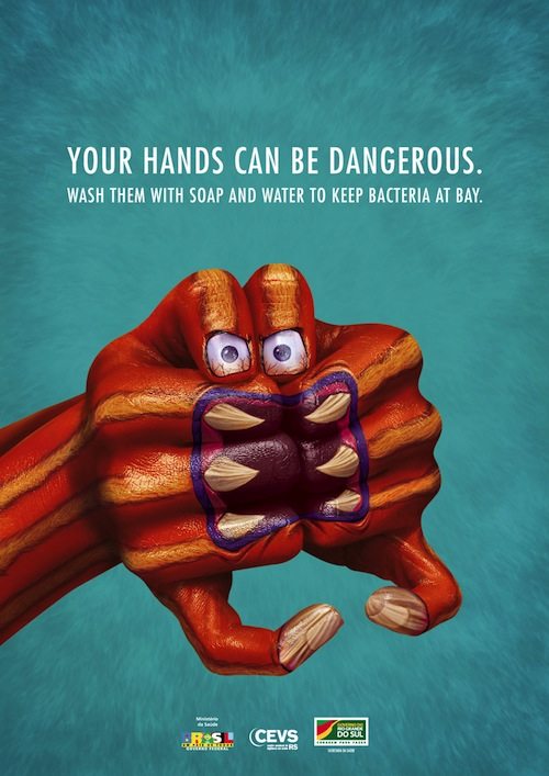
According to the Centers for Disease Control and Prevention, hand washing is among the most essential and effective steps that can be taken to stop the spread of harmful pathogens. It’s a public service message – although it’s also one that sells products for some of the world’s largest pharmaceutical companies. Still, if it helps improve public health, who are we to argue?
So what makes an amazing hand hygiene poster? Well, it appears that the key is to create a powerful and compelling message that’s backed up by an obvious answer – namely, the product in question. Sometimes eliciting fear works, but a simple, cleverly executed message can also do the trick. One particular solution, it seems, is to make people aware of the potentially harmful things they touch on a day-to-day basis without even realizing it. Read on for ten powerfully creative ads that make us want to take better care of our hands.
10. Just Liquid Soap

Created by Euro RSCG Mumbai and released in March 2008, this shocking ad powerfully promotes the use of Just Liquid Soap, playing on parents’ natural instincts to protect their babies from harm. What makes the concept even more alarming is the implication that it’s the unsuspecting guardian figure that is putting the child in harm’s way by not practicing proper hand hygiene. The other two ads in the series are just as disturbing. One features a patient being fed medicine by a maggot-infested hand, while the other shows a woman preparing food with worms on her forearms. The similarly uncompromising slogan on each poster rams the point home: “If you aren’t totally clean, you are filthy.”
9. Lifebuoy Handwash
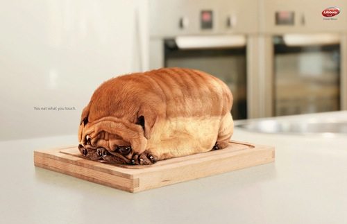
When it comes to advertising hand hygiene, animals aren’t treated as cute, fluffy and lovable. Instead, they can be the enemy. This stylish and well-received advert for Unilever’s Lifebuoy Handwash picked on pets to deliver an essential message, “You eat what you touch.” Each poster features an animal in the shape of a different food item: a hamster as a muffin, a cat as a croissant, a fish in the shape of a baby bottle, and a dog as a loaf of bread. The ad, designed by the Indonesian branch of Lowe and Partners, tied in with Unilever’s direct-contact health education scheme, which aimed to promote good hygiene in rural Indian communities to combat avoidable diseases. The “Kitten” and “Hamster” ads were both shortlisted at the 2009 Cannes International Advertising Festival, and the bread-shaped “Dog” ad was awarded a Bronze Lion.
8. Sanzer Hand Gel
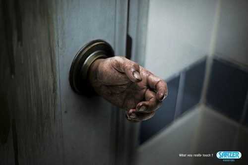
“What you really touch?” sounds like a pretty ominous advertising message. The imagery delivers, too: it’s terrifying. This gritty, three-part Sanzer Hand Gel ad series features a subway train, a phone booth and a doorknob you’d never want to turn. In each ad, grubby hands and fingers have replaced everyday items you’re likely to touch without even thinking about it – yet the most chilling concept in the series is definitely this horror movie-esque door handle. The campaign was devised by Thai advertising agency Chuo Senko and was published in August 2010. It effectively promotes the idea that health hazards are all around us and that we need to take the proper precautions. We’re definitely reaching for the Sanzer Hand Gel right about now.
7. Carre Fresh

“Shockvertising” can also play a part in hygiene ad campaigns. This advert for Carre Fresh wipes seems to want to alarm people into practicing good hand hygiene – and into buying the product, of course. It highlights all the gross things you might have touched, without even realizing, before you eat. In other words, as the advert implies, you might as well eat with your shoes. The other two ads in this series include a woman eating from a dustpan and a baby being fed with a spoon coming out of a toilet brush. It’s an effective message backed up by some pretty unnerving imagery. The campaign was devised by Bangkok-based advertising agency CreativejuiceG1 and was released in May 2008. The simple slogan reads, “Wipe whatever you’ve touched.”
6. Carex Hand Wash
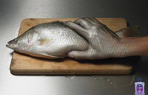
This advert, simply titled “Fish,” is both clever and powerful. It was developed for print by the Thai division of global advertising network McCann-Erickson and was first published in February 2009. Fish are particularly prone to a broad range of bacterial pathogens, and the message of this image seems to take into consideration this fact, suggesting that you wash your hands (with Carex Handwash) after touching the animals, dead or alive. Subtle touches, like the hand’s tight grip and the liquid oozing from beneath the chopping board, add to the sense of menace.
5. Dettol Liquid Hand Wash
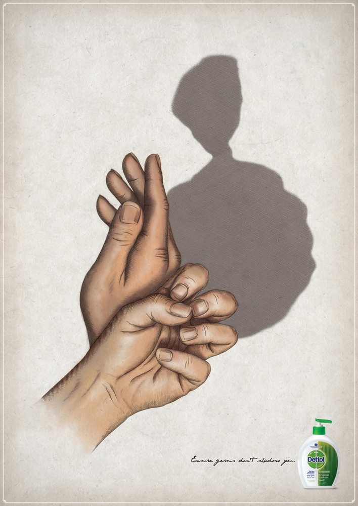
This less frightening Dettol Liquid Hand Wash ad neatly uses a hand shadow of a garbage bag to make its point – along with the tagline, “Ensure germs don’t shadow you.” Here, the creative imagery reinforces the idea that bacteria is constantly lurking on everyday items, waiting for a chance to get at you, and it’s up to you to protect yourself – with Dettol Liquid Hand Wash, of course. This ad was created by Euro RSCG UAE and was first published in December 2010. The other two images in the series feature an old shoe and a toilet.
4. Kimberly-Clark Professional
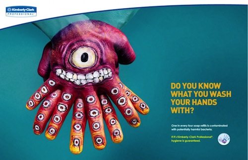
Image Source
“Do you know what you wash your hands with?” That was the question this 2010 Kimberly-Clark Professional advertising campaign asked. The ad was backed up by the frightening statistic that “one in every four soap refills is contaminated with potentially harmful bacteria,” as well as the more comforting line, “If it’s Kimberly-Clark Professional, hygiene is guaranteed.” With this ad, Ogilvy Costa Rica effectively used body paint to deliver an attention-grabbing message that neatly combines cartoon fun with serious overtones. Unlike most hand hygiene ads, though, this one doesn’t highlight general bacterial pathogens but instead focuses on the often-false faith we have in soap dispensers.
3. Dettol Instant Hand Sanitizer

Some hand hygiene adverts incorporate the kind of imagery you’d expect to find in horror movies, and the effect is often made even creepier by an unsuspecting central character, as in this ad for Dettol Instant Hand Sanitizer. Fear can sometimes be an effective tool for getting an advertising message across, although relying too heavily on it as a strategy may put off some consumers. Still, the solution to this particular problem – that is, Dettol Instant Hand Sanitizer – is displayed prominently at the base of the ad. And the message that it “kills 99.99% of germs on hands, without the need for water” also emphasizes the fact that it’s useful for people on the go. A blunt advert, perhaps made even blunter by the plaster visible on the front hand, it was created by the Sydney branch of global marketing agency Euro RSCG and was first published in July 2008.
2. Protex Antibacterial Hand Sanitizer

This striking Protex Antibacterial Hand Sanitizer advert, one of a three-part series, uses the game rock-paper-scissors to make its point. In the three ads, the hand protected with Protex Antibacterial Hand Sanitizer always defeats its opponent, a bunch of pathogens. The ad is backed up by the message that Protex Antibacterial Hand Sanitizer “eliminates 99.9 percent of bacteria.” The Brazilian wing of global advertising agency Y&R created the colorful campaign, which first appeared in April 2012. Perhaps it’s no surprise that the brand drew inspiration from the familiar schoolyard game, as Protex has a history of educating young children about the consequence of proper hand hygiene.
1. Purell Sanitizer
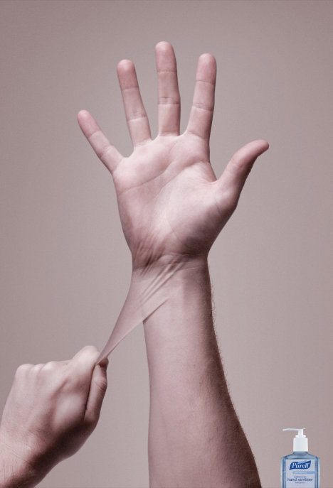
Not all hand wash adverts have to scare or shock. This Johnson & Johnson Purell Sanitizer ad illustrates the fact that a simple image can be just as effective in conveying a clear health message – in this case, that “using Purell Sanitizer is just like wearing a glove” in protecting our hands. This ad was designed by JWT Sydney and was released in Australia in February 2008. The image, simply titled “Hand-Glove,” is intelligently thought-out and uses subtle imagery to make its point.